
What is your font style?
Every day you see in your life there is a design product that affects you positively or negatively. No, I am not talking about the phone in your pocket. This is such a design product… if you are writing with a computer; you are actually making some kind of design by choosing its type. Depending on the type you choose, it can make you vizier or vile!
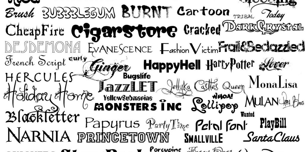
Welcome to the colorful world of fonts…
To really act like a designer… there are only two fonts you need to know— “Helvetica” and “Comic Sans”.
Let’s learn about “Helvetica”, which will make you vizier. This is such an important font that an 80 minute documentary has been made about it. It is important because you can see its usage almost everywhere, in the ads, logos, sheets, and wherever you look around you can notice the “Helvetica” font. So why is this font so popular?
Because it is designed in a way that is suitable for the purpose of typography, it is legible, it can be perceived very easily, net, a neutral font. It shows you the content not the design. It must be from the hometown of “Helvetica” designer… it means Swiss in Latin. Although it is so widely used, let’s make clearer for the generation of computers when they hear the name “Helvetica” for the first time…you know, there is a font that comes installed with every computer, which is “Arial” font, that is actually originated from “Helvetica” as an alternative solution, to be used without license. Although it is a different font in details but actually in all dimensions exactly the same as “Helvetica”. So there are just differences in the details. The interesting thing is that a team of 10 people worked to introduce the differences in these details. It’s enough to look at the letter”C” to distinguish the two fonts.
All fonts have a character and gender just like the persons around you…while thick and rough-stalk, and quoted fonts expresses masculine. Thin, twisted, non-quoted fonts are often considered feminine. Now you will ask…So what does this “quoted” and “non-quoted” font mean?
QUOTED fonts have hands, feet, and shoulders, while NON-QUOTED fonts are flat. Quoted fonts are often easier and more fluid to read, so they are often preferred in long texts. Non-quoted fonts are preferred over titles or small fonts that are much shorter. Though non-quoted fonts were used on digital screens at the beginning, but today we can use all kinds of fonts on digital screens because it has reached very high resolutions.
As for the “Courier” font, they often call it a font used by librarians, those interested in serious works. But…for example, if you are planning to write a script for Hollywood, the font you have to choose is “Courier”. This is a universal scriptwriting standard that has been used for almost 100 years and has not changed. Because approximately one A4 page written with “Courier” font in 12 font size, is equivalent to one minute image. But if you are thinking of designing posters and banners instead of writing scripts for the world of cinema, the font you should use in this case is “Trajan” font. You can see this font easily in more than half of the posters.
Using uppercase or lowercase of the fonts also has a meaning and a function. For example, lowercase letters are generally preferred in traffic signs because lowercase letters are much easier to read and understand when traveling at high speeds.
If you are wondering who invented the world’s first font, the answer to your question is the printing press designed by Gutenberg. Of course, the letter characters were used much earlier in terms of hand writing, but with the printing press it was necessary to set a standard for this. The first font designed and used in the first published Bible at the printing press in 1455. This actually has a steep writing characteristics and this type of font is called “Roman”. In the history Romanians used this type of steep and quoted fonts.
When we come to the 1500s, we see that Italians also entered the printing business and they made the font type of the text “Slanted”, which is more like handwriting. Because more letters can be placed on one page with using “Slanted” font so the number of pages of a book could be reduced, and this automatically reduces the costs of the printing press and the book’s price as well. For this reason, Italic character is called “Italic”, it comes from Italy.
In addition to the characters, psychology of the fonts can also be mentioned. “Tell me your font and I’ll tell you who you are”: reliable, impressive, reputable, determined, traditional, universal, clean, modern, lens, stable, brave, strong, modern, sturdy, sumptuous, feminine, distinguished, friendly, amazing, creative, special, trendy, stylish, sharp, clever, etc.
Let’s come to the naughty child of the fonts world…you can forget all other fonts because the second most important font you should know after “Helvetica”…is “Comic Sans”. It is the most controversial, unreliable, and the lightest character of font in the world. However, it still is very common. When professional designers see this font, they will have nervous breakdown. Some people have gone so far that they opened a website to ban the font “bancomicsans.com”. We do not know why it so controversial, why it is not loved but…not to overdo it. What you need to know is if you are using “Helvetica” you are on the safe side, and if you use “Comic Sans” you will be excluded.
Writing is the basis of communication and as you can see, the fonts directly affect it. As we all write, we can actually take a step towards design with a font that we choose correctly.
Translated by: Shaymaa Jalil
Reference: Barış Özcan- personal documentarian on YouTube
Video link: https://youtu.be/A_IMnGvaWtE
Accessed: 10 Feb. 2020